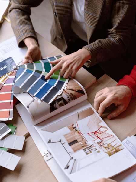
The Role of Colour in Commercial Interior Design
Colour is a fundamental element in commercial interior design, playing a crucial role in shaping the aesthetic, mood, and functionality of a space.
This article provides a comprehensive analysis of how colour impacts commercial interior design, emphasising the importance of thoughtful colour selection in creating environments that are not only visually appealing but also conducive to the intended use of the space.

Understanding the Psychological Impact of Colour
The influence of colour psychology is profound, especially in commercial environments where the right palette can set the tone for the entire customer experience. In this section, we delve into how different colours can shape emotions and behaviours, making them a crucial element in commercial interior design.
Colour Choices for Different Commercial Settings
- Restaurants and Food Services: Discuss how warm colours like red and yellow can stimulate appetite and create a welcoming atmosphere.
- Retail Spaces: Explore how colour impacts shopping behaviour, with vibrant colours often used to attract attention to promotions and cooler tones to create a high-end feel.
- Offices and Workspaces: Delve into how colours like green and blue can enhance focus and productivity, while softer hues can reduce stress.
Cultural and Demographic Considerations
- Cultural Associations: How colour preferences and associations can vary across different cultures, impacting the choice of colours in international or diverse settings.
- Target Audience: Tailoring colour choices to resonate with a specific demographic or customer base.

Colour in Branding and Identity
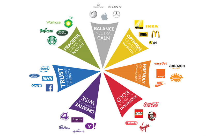
In the arena of commercial design, colour is a vital component of a brand’s visual identity, serving as a powerful branding tool. This section explores the intricate relationship between colour and brand identity in commercial design.
- Brand Recognition: Discuss how color increases brand recognition and recall. For example, certain shades are so closely tied to brands that they become synonymous with them.
- Emotional Connection: Explain how brands use colour to evoke specific emotions and connect with their audience on a psychological level.
Aligning Colour with Brand Personality
- Reflecting Core Values: Explore how colours are chosen to reflect a brand’s ethos and core values. For example, green often represents eco-friendliness or health, while black might be used to convey sophistication and luxury.
- Target Audience Alignment: Highlight how colour choices can be tailored to resonate with a brand’s target demographic, enhancing relevance and appeal.
Optimising Space with Color: A Functional Approach to Commercial Design
Transforming Spaces with Strategic Colour Choices
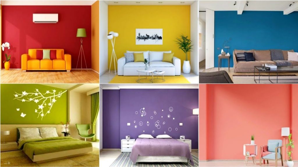
The perception of space in commercial interiors can be significantly influenced by colour. Lighter colours have the power to make a room feel more spacious and open. On the other hand, darker shades add depth and can give a sense of coziness to a larger area. Colours like deep blue, rich green, or warm maroon can be used to create more intimate areas within a larger space, making them feel more inviting and comfortable. Bright colours can reflect light, making a space feel more illuminated and vibrant. Conversely, dark colours absorb light, which can be used to create a more subdued, relaxed environment. This interplay between colour and light is crucial in setting the desired ambience in a commercial space.
Navigating Colour Trends and Timelessness in Commercial Design
Exploring Current Colour Trends
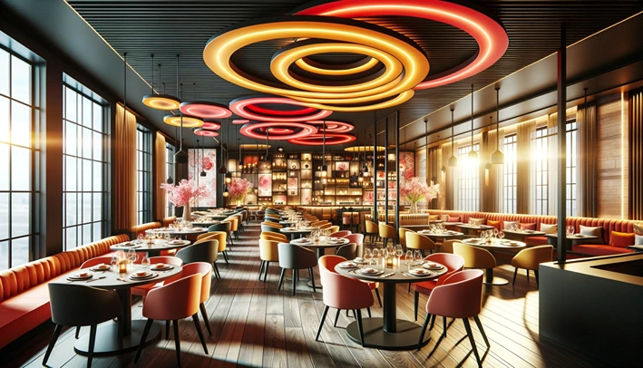
Today’s commercial spaces often feature bold and vibrant colours. These energetic hues are a departure from traditional palettes, bringing a fresh and dynamic vibe to spaces. For instance, deep blues and bright oranges are being used in innovative ways to energize and attract attention.
Nature-inspired colours are also gaining traction. Shades like olive green, terracotta, and ocean blue are increasingly popular, reflecting a growing desire for organic and calming environments. These colours not only bring a sense of tranquillity but also connect indoor spaces to the natural world outside.
Soft pastels and muted tones are making a comeback too, providing a minimalist yet sophisticated look. These hues offer a modern twist to traditional colour schemes, giving commercial spaces a contemporary edge.

Crafting Customer Experiences: The Strategic Use of Colour
Elevating Experiences Through Colour Schemes
Colour schemes have the power to set the tone for a customer’s experience within a commercial space. For instance, a restaurant might use warm, appetizing colours like reds and oranges to create a vibrant and welcoming atmosphere. Conversely, a luxury spa might opt for soft blues and greens to evoke a sense of tranquillity and relaxation.
The key lies in choosing a colour palette that not only looks visually appealing but also aligns with the emotional tone you wish to set for your space. Colours have the unique ability to evoke certain emotions – blues can be calming, yellows energizing, and greens refreshing. Understanding these emotional cues is crucial in creating an environment that resonates with customers.
Target Audience-Focused Color Selection
Tailoring your choices to your target audience is essential in creating an effective and appealing commercial space. Each demographic group may respond differently to certain colours, influenced by factors such as age, cultural background, and personal preferences.
For instance, a children’s play area might incorporate bright, primary colours to stimulate playfulness and creativity, while a high-end fashion boutique might use a monochromatic or neutral palette to create an upscale, sophisticated feel. By focusing on colour schemes and audience-focused colour selection, businesses can craft environments that not only attract customers but also enhance their overall experience.

Expert Tips for Colour Selection in Commercial Spaces
Restaurants and Retail Spaces
For restaurants and retail spaces, colours can be used to create an inviting atmosphere and stimulate customer engagement. Warm colours like reds and yellows can evoke feelings of hunger and excitement, which are ideal for eateries. In retail spaces, consider your brand identity and the type of products you sell. High-energy colours can be great for stores targeting younger demographics, while sophisticated neutrals might suit luxury boutiques.
Healthcare Facilities
In healthcare settings, soothing colours like soft blues, greens, and lavender are often preferred. These colours can help create a healing and tranquil environment, reducing stress and anxiety for patients and visitors.

Offices and Workspaces
For offices, colours that enhance productivity and focus are ideal. Shades of blue are known to stimulate the mind, yellows can inspire creativity, and greens can create a sense of balance and calm. However, it’s important to consider the type of work being done in the space and choose colours that support those activities. The right choices can transform a commercial space, making it not just a place to visit, but an experience to remember.

Colour Innovation: Breaking the Mold in Commercial Design
Embracing Bold and Non-Traditional Colours
The trend towards bold and non-traditional colours is a notable shift in commercial design. Designers are increasingly experimenting with unconventional colour combinations to create unique and memorable spaces. For example, a fusion of neon hues in a tech startup’s office can reflect its innovative and dynamic spirit. Similarly, the use of unexpected colours in a traditional setting, like a bright pink or electric blue in a bank, can challenge conventional norms and make a strong visual statement.
Creating Thematic Experiences with Colours
Colours are being used to craft thematic experiences in commercial spaces. This approach goes beyond mere aesthetics, engaging customers at an emotional and experiential level. For instance, a beach-themed resort may use shades of blue and sand to transport guests to a seaside escape. Retail stores are utilising thematic colour schemes to enhance the shopping experience, creating environments that align with their products and brand story.
Integrating Technology with Colour
Technological advancements are offering new ways to use colour in commercial spaces. Smart lighting systems that change colours to create different moods or highlight certain products are becoming increasingly popular. Interactive installations where colours change in response to human touch or movement are also emerging, adding a dynamic and engaging element to commercial interiors.

Embracing Colour with Confidence and Creativity
In this blog, we’ve traversed the spectrum of colour in commercial interior design, from the psychology of colour to its functional use, and the exciting possibilities the future holds. We’ve seen how colour can shape brand identity, influence customer experiences, and stay adaptable to changing trends.
As we conclude, we encourage you, whether a business owner, designer, or enthusiast, to think creatively and strategically about colour. The right choices can transform a commercial space, making it not only visually appealing but also emotionally resonant and functionally effective. Use colour to tell your story, set the mood, and leave a lasting impression.

Frequently Asked Questions
Vibrant colours attract attention to promotions and products, while cooler tones create a high-end, relaxing feel, influencing customer engagement and purchase behaviour.
Colour schemes can evoke specific emotions and create desired atmospheres, such as vibrant and welcoming for restaurants or tranquil and luxurious for spas, enhancing customer experiences.
Colour is significant when selecting furniture for your commercial project because it influences the mood, perception, and functionality of the space. The right colours can enhance productivity in office environments, create a welcoming atmosphere in hospitality settings, and convey your brand’s identity effectively. It’s crucial to choose colours that align with the purpose of the space and the desired ambiance.
Lighter colours make spaces feel more open and spacious, while darker shades add depth and coziness, impacting the overall ambience and functionality.
Smart lighting systems and interactive installations can change colours in response to human touch or movement, adding a dynamic and engaging element to the interior design.